01 Project Overview
The Capitol Reef Field Station (CRFS) was a client as part of a year-long senior capstone project at Utah Valley University (UVU). CRFS is the property of the National Park Service but is operated under the direction of UVU. CRFS is only accessible to students and faculty from institutions of higher learning and offers engaged learning, research, scholarly/creative activities, and environmental ethics.
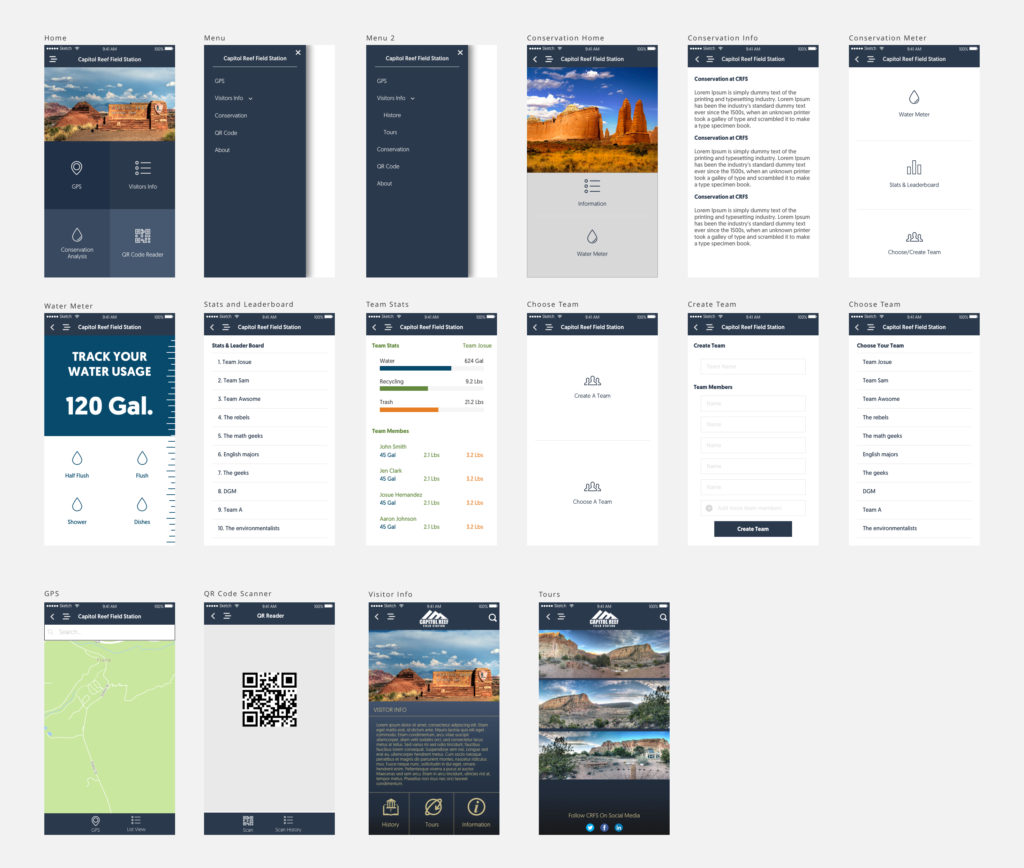
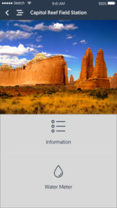
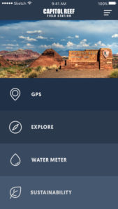
Conservation influences every aspect of the field station including the design of the facility to the way classes are conducted. Visitors are immediately introduced in their orientation to key concepts in conservation and sustainability. They are also informed of their water usage during and at the end of their visit, helping them remain aware of the precious resource during their stay. Additionally, prior to departure, visitors are informed of their total garbage production, which allows for further discussion of sustainability with respect to waste reduction and recycling. In particular, CRFS seeks to have a lasting impression on visitors that will impact their lives well beyond the time they spent there.
PROBLEM
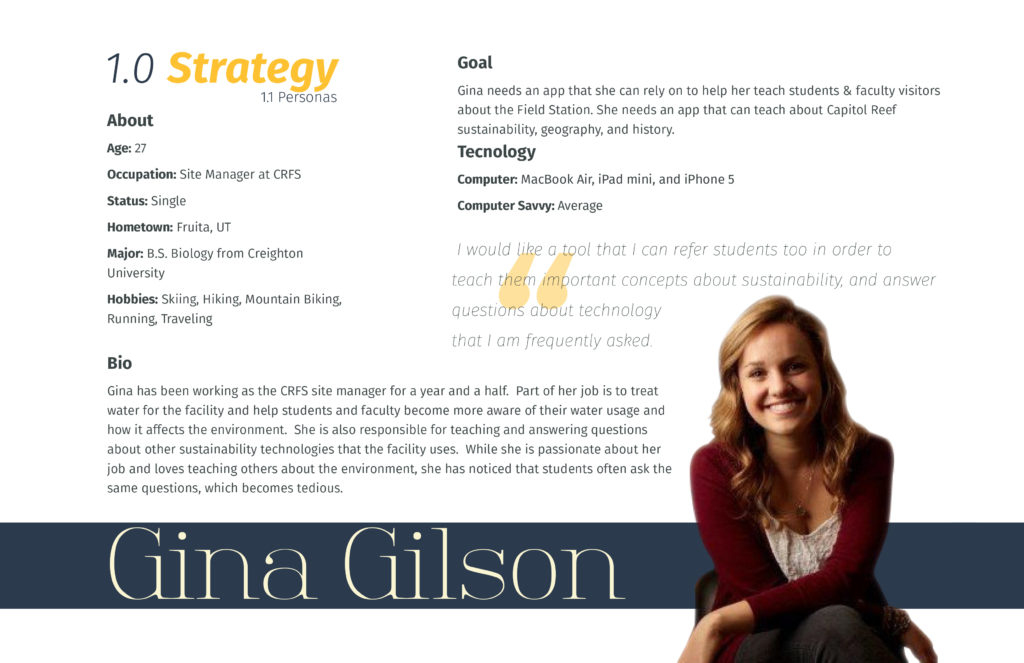
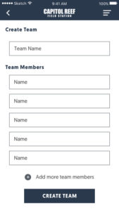
The CRFS site manager is responsible for educating and informing each new visitor of the field station conservation and sustainability guidelines. She needed a resource to assist her in informing and educating visitors of these guidelines.
OBJECTIVES:
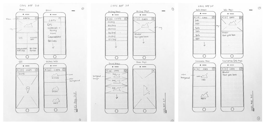
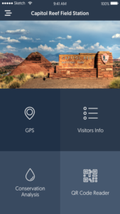
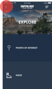
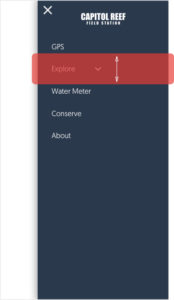
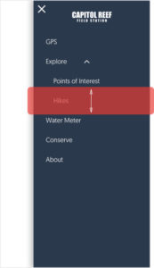
- To create an app that will teach students and faculty visitors about the Field Station, sustainability, and conservation.
- To create an app that will educate visitors about Capitol Reef geography and history.
ROLE
Graphic Design. Designed and created all visual documentation including Project Proposal, Design Document, Final Report. I also contributed to the user interface design creating wire-frames, and interactive mock-ups via InVision.