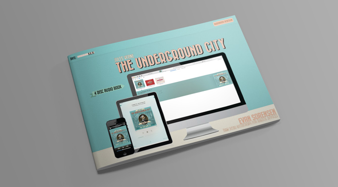

Audiobook Metadata and Cover Redesign – Jules Verne
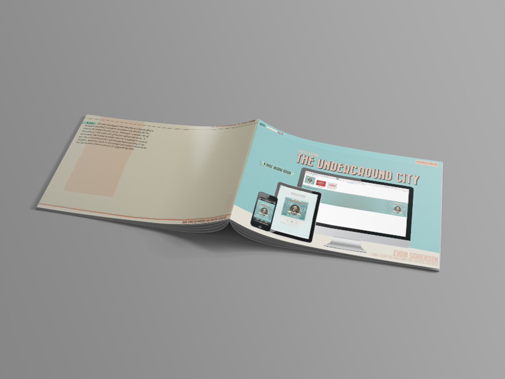
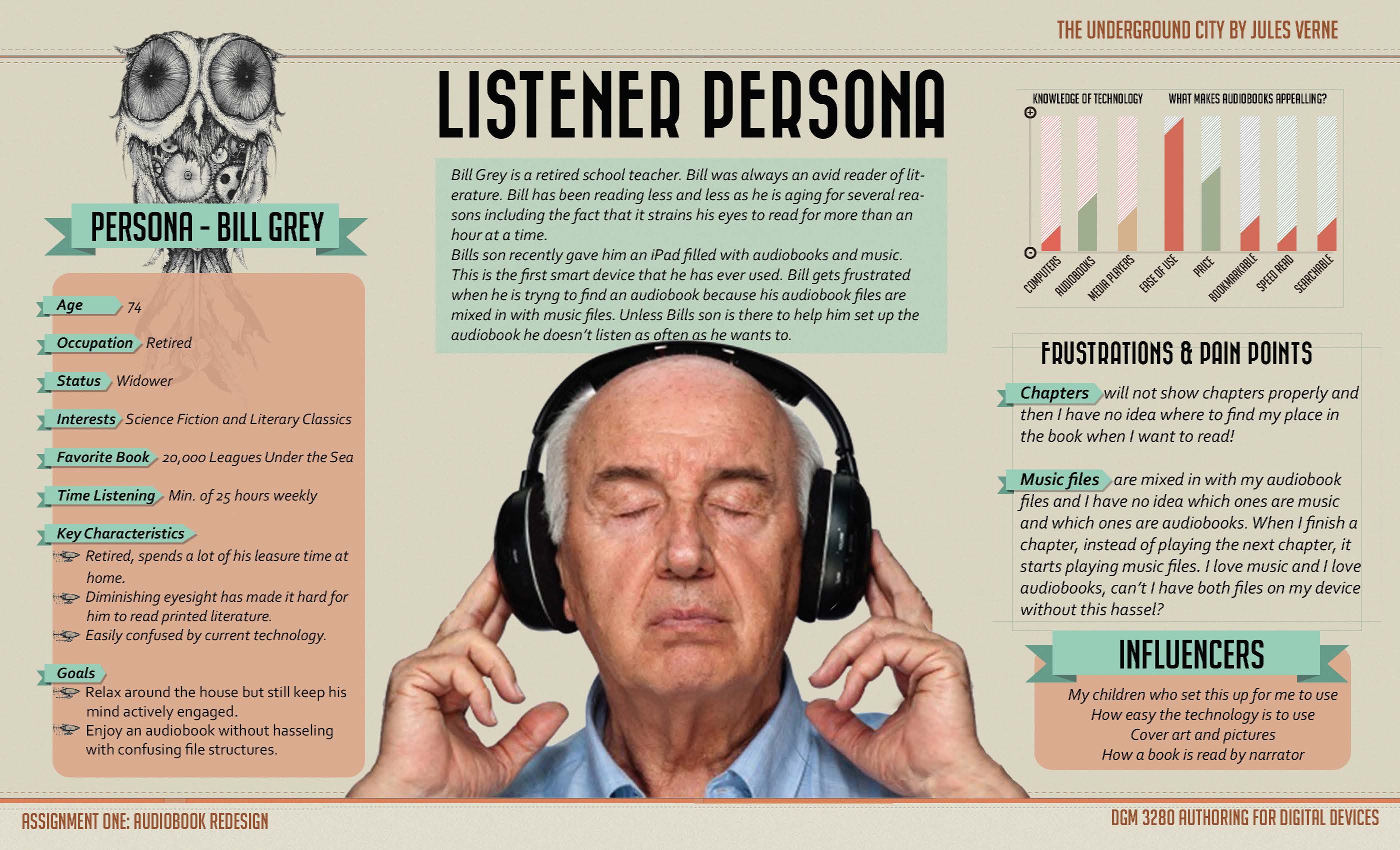
The design of something with the end user in mind has always intrigued me. So much of design is (or should be) done with the end user in mind. With this in mind, in one of my Digital Media courses at UVU (DGM 3280 – Authoring for Digital Devices), where we documented the process of User Experience/Design or UX/UI Design on two different projects. The first project was creating a podcast from start to finish and the second was taking an audiobook file and repackaging or redesigning it, again with the end user experience as the point of all design and/or redesign. Below is a slideshow of the documentation of both of these products.
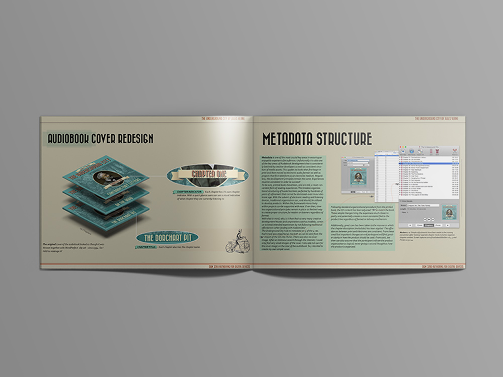
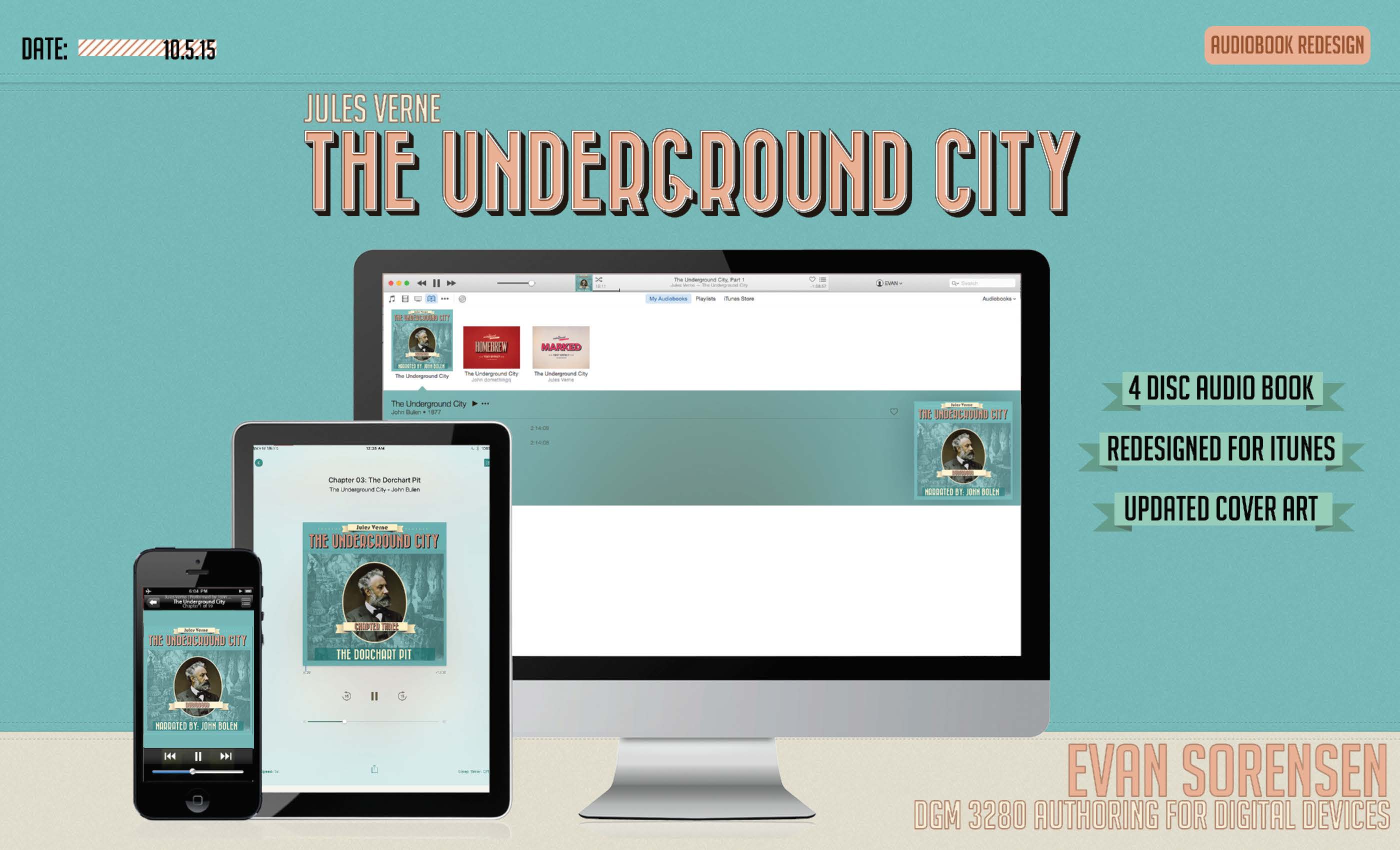
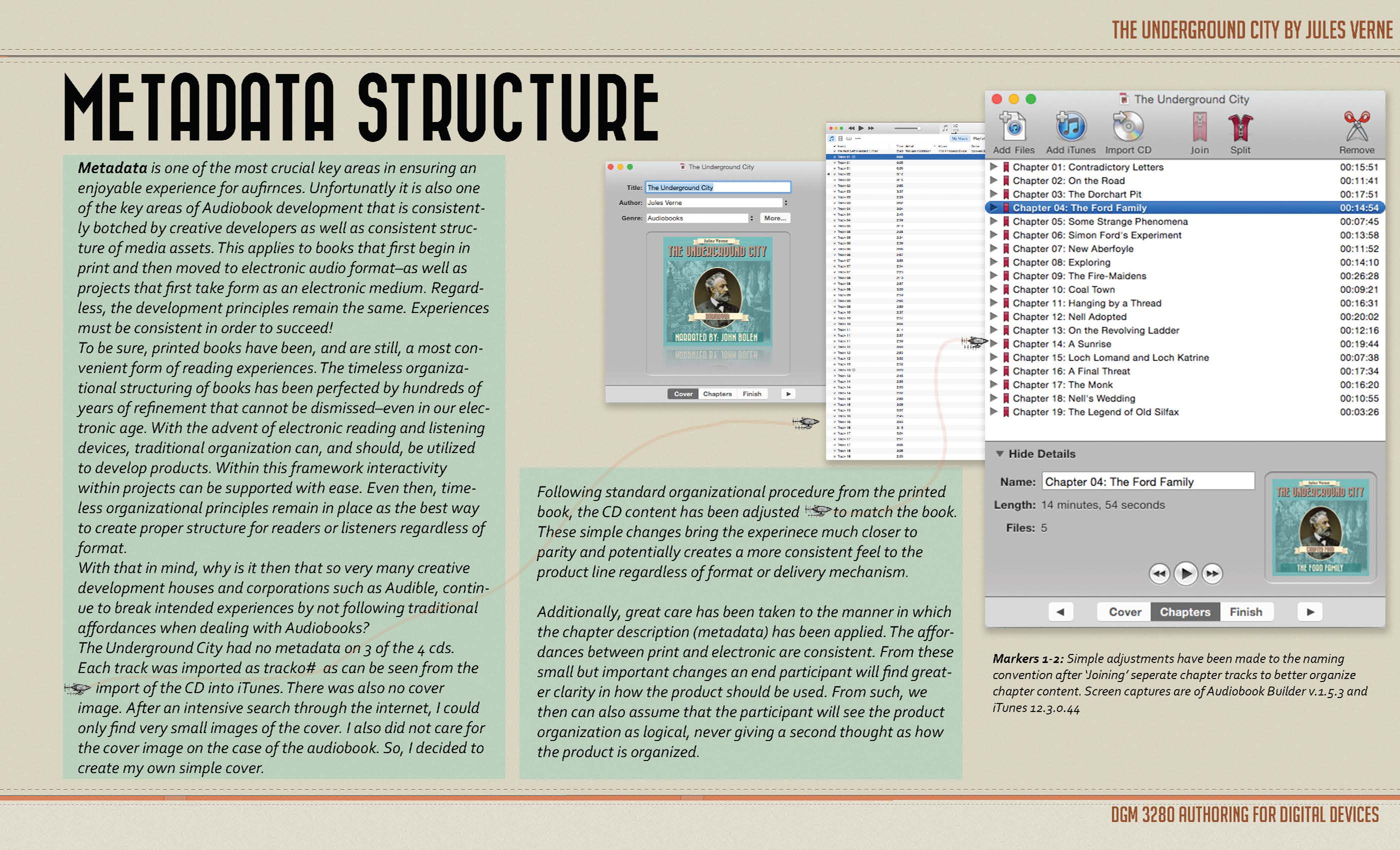
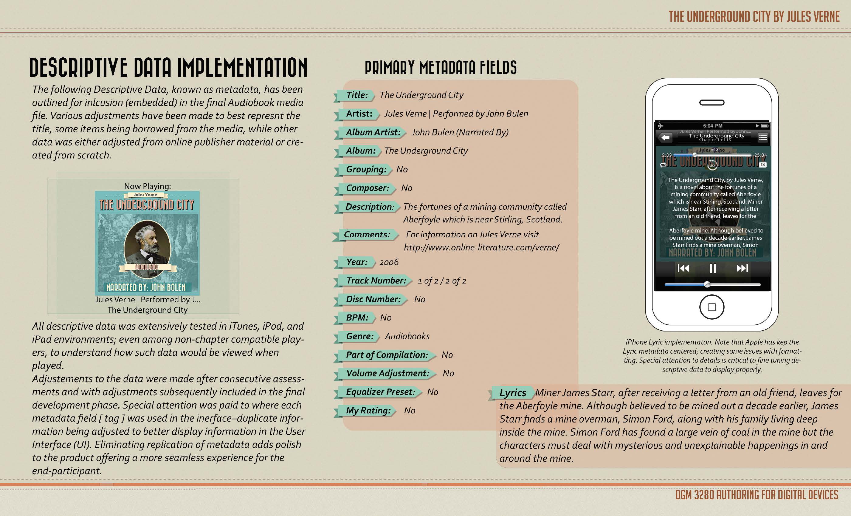
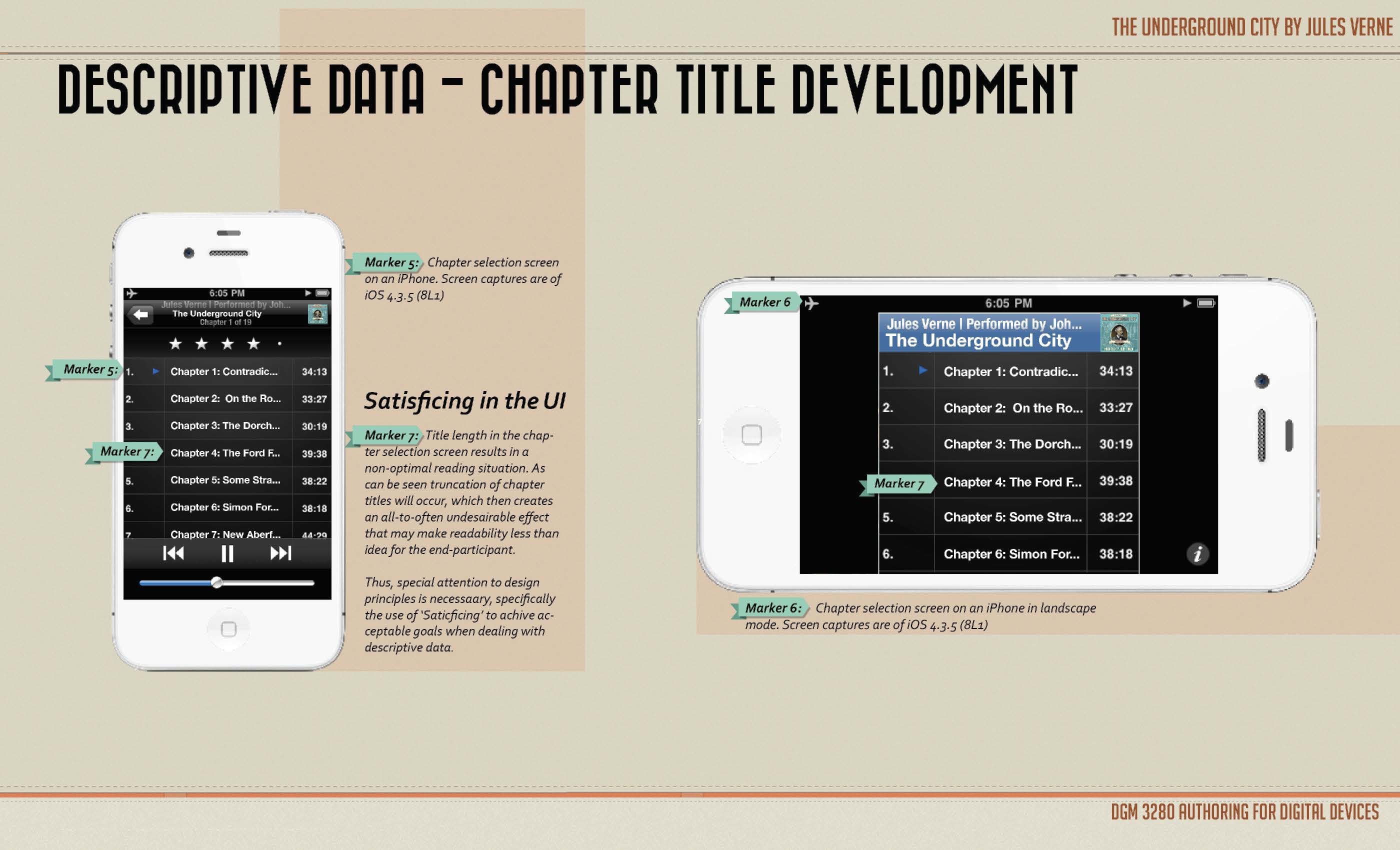
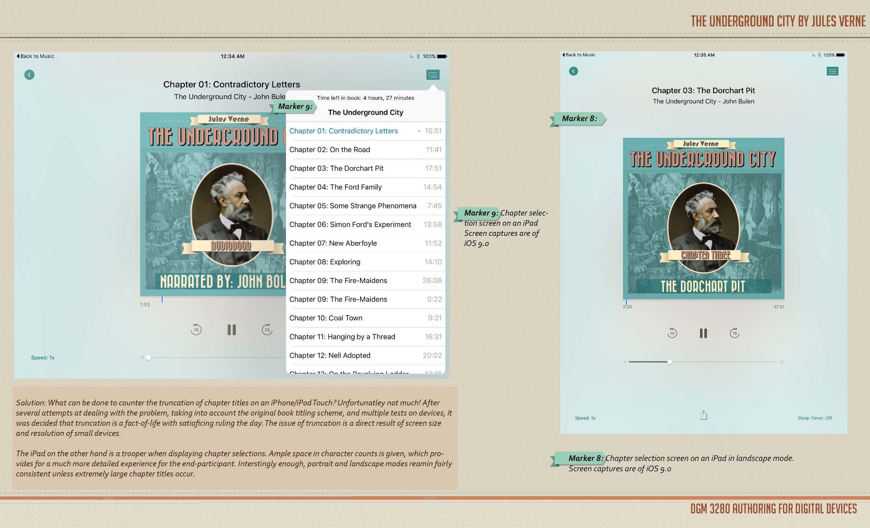
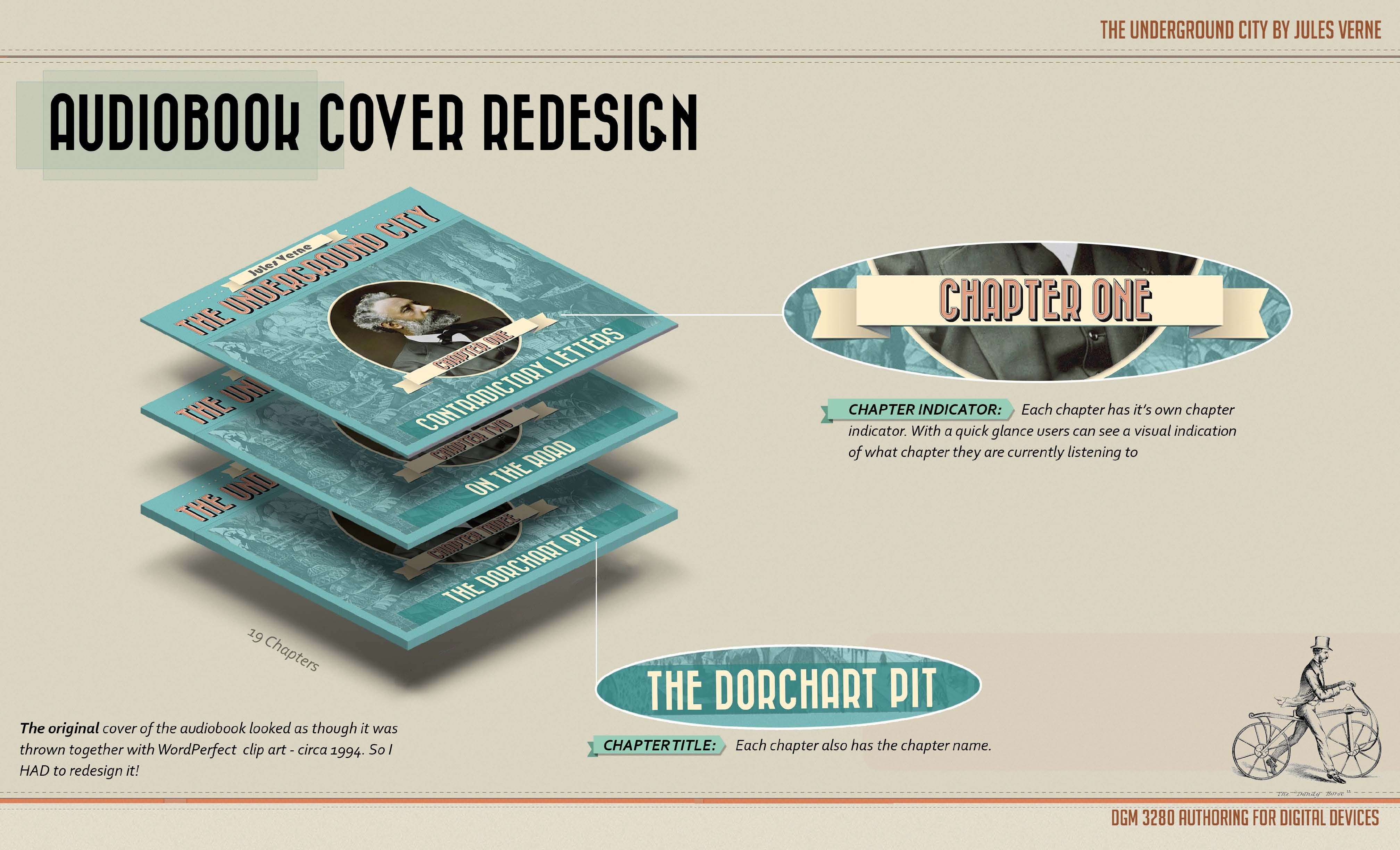
The audiobook I chose to redesign was The Underground City, by Jules Verne. The original audiobook was an absolute failure from a user experience point of view. From the poor cover design to the annoyingly horrible meta data strewn across 5 CD Roms forcing the end user to search through tracks labeled D1m12, D1m143…etc. Instead of easily finding their place through well named and organized tracks broken up into chapters.
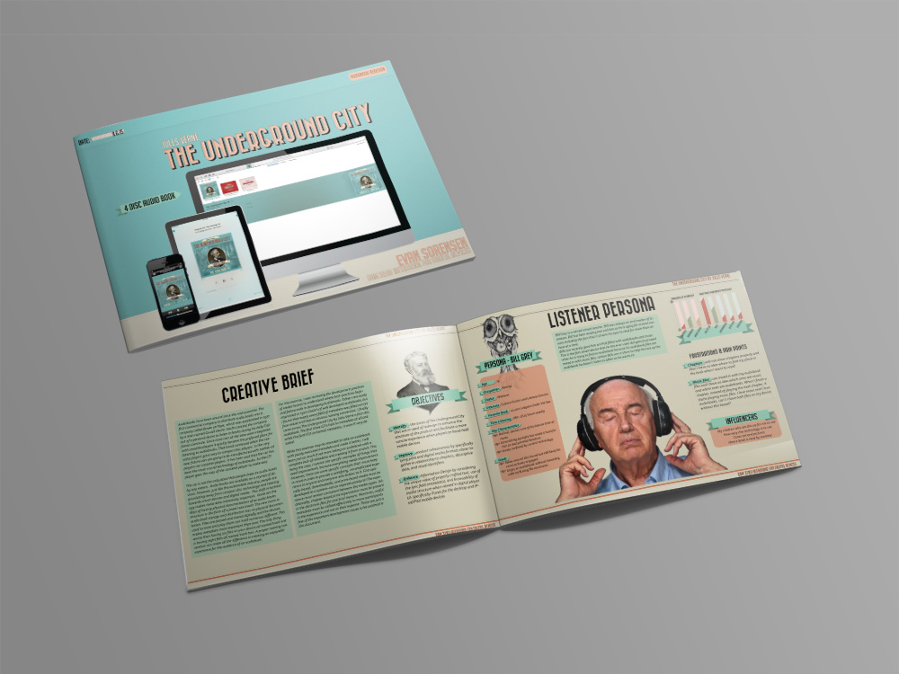
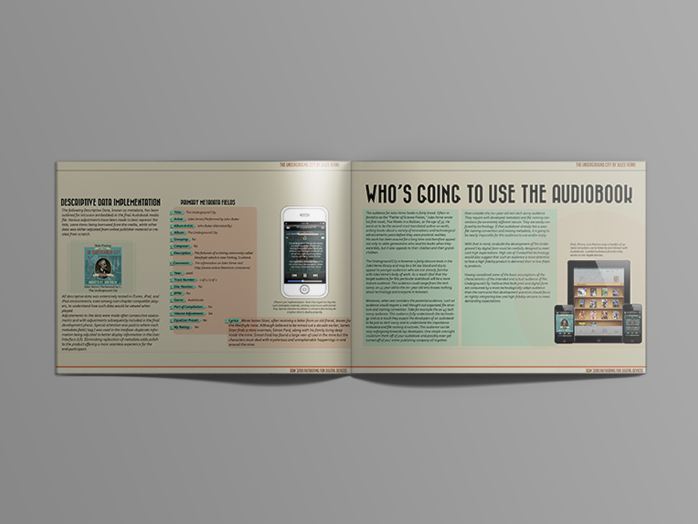
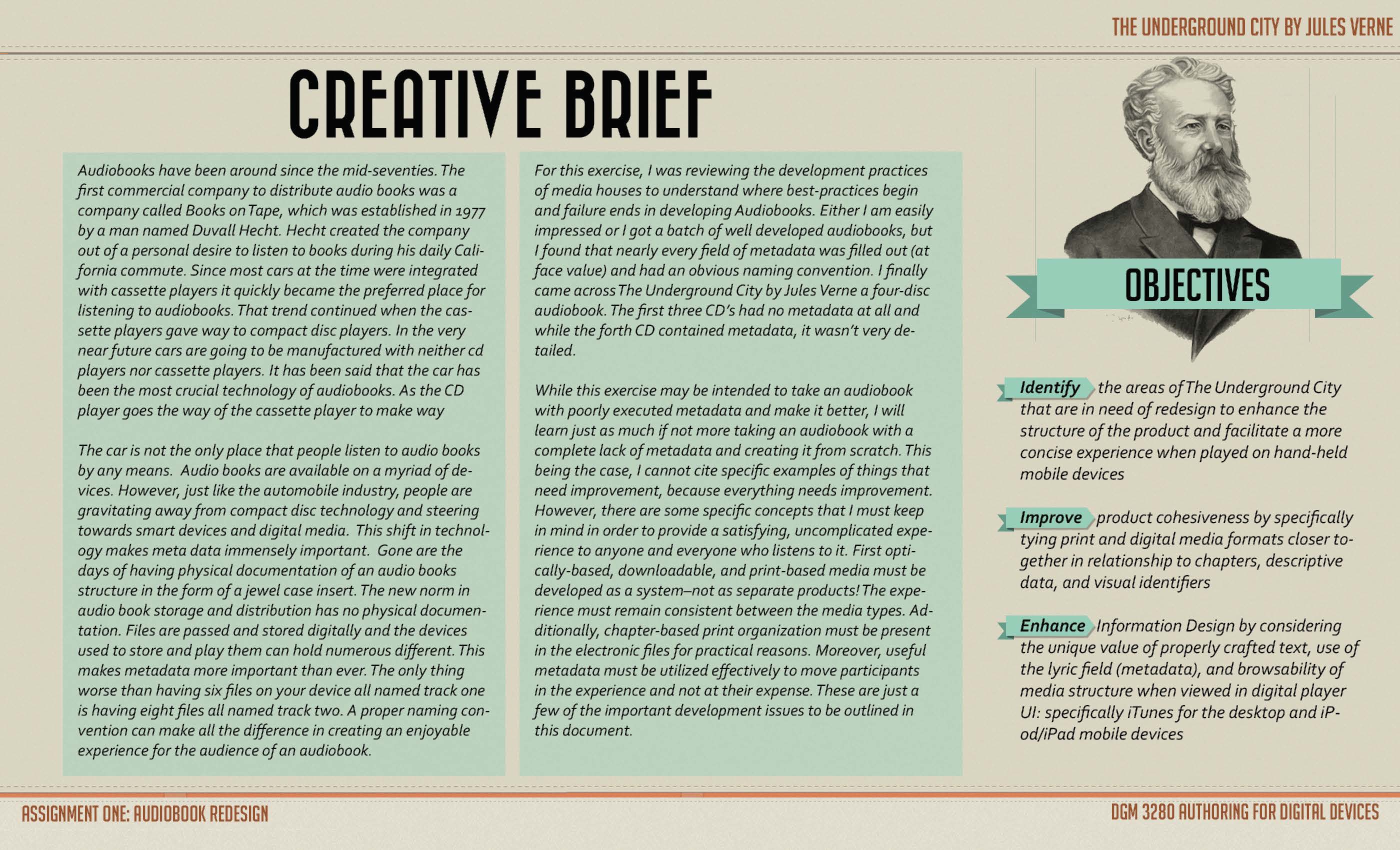
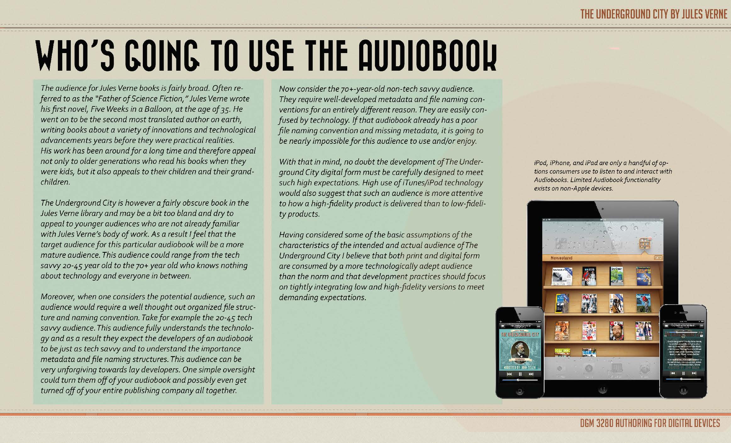
This is the Design Document that I created before actually redesigning the user experience.
